Solutions for Lecture 4
Exercise 1
Load data
# install.packages("WDI")
library("WDI")
library("dplyr")

df = WDI(indicator = "NY.GDP.PCAP.KN" ,
         start = 2010, end = 2010, extra = F)
df = df %>% filter(!is.na(NY.GDP.PCAP.KN))
Question 1: use the map package and the GDP data to make a world map of GDP per capita.
Solution
library("ggplot2")
library("maps")
map = map_data("world") # load world map

df.map = left_join(df, map, by = c("country" = "region")) # join data

p = ggplot(df.map, aes(x = long, y = lat, group = group, fill = NY.GDP.PCAP.KN))
p + geom_polygon() +
  expand_limits(x = df.map$long, y = df.map$lat)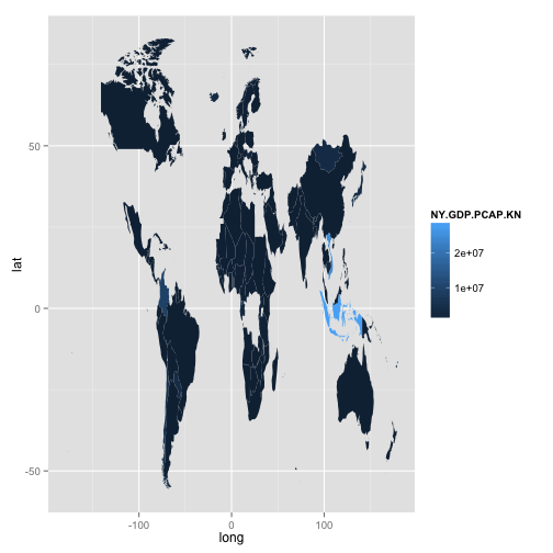
This is ok, but a lot of countries are missing.
We can see which countries from the World Bank data can’t be matched in the map data
df$country[!unique(df$country) %in% unique(map$region)]## [1] "Antigua and Barbuda" "Armenia"
## [3] "Azerbaijan" "Bahamas, The"
## [5] "Belarus" "Bermuda"
## [7] "Bosnia and Herzegovina" "Brunei Darussalam"
## [9] "Cabo Verde" "Congo, Dem. Rep."
## [11] "Congo, Rep." "Cote d'Ivoire"
## [13] "Croatia" "Czech Republic"
## [15] "Egypt, Arab Rep." "Eritrea"
## [17] "Estonia" "Gambia, The"
## [19] "Georgia" "Hong Kong SAR, China"
## [21] "Iran, Islamic Rep." "Kazakhstan"
## [23] "Korea, Rep." "Kosovo"
## [25] "Kyrgyz Republic" "Lao PDR"
## [27] "Latvia" "Lithuania"
## [29] "Macao SAR, China" "Macedonia, FYR"
## [31] "Micronesia, Fed. Sts." "Moldova"
## [33] "Montenegro" "Palau"
## [35] "Russian Federation" "Serbia"
## [37] "Singapore" "Slovak Republic"
## [39] "Slovenia" "South Sudan"
## [41] "St. Kitts and Nevis" "St. Lucia"
## [43] "St. Vincent and the Grenadines" "Tajikistan"
## [45] "Timor-Leste" "Trinidad and Tobago"
## [47] "Turkmenistan" "Ukraine"
## [49] "United Kingdom" "United States"
## [51] "Uzbekistan" "Venezuela, RB"
## [53] "West Bank and Gaza" "Yemen, Rep."A better solution involves using the countrycode package.
library("countrycode")
map$iso2c = countrycode(map$region, origin = "country.name", destination = "iso2c")
Merge the data
df.map.2 = left_join(df, map) # merge data by iso2Make the plot
p = ggplot(df.map.2, aes(x = long, y = lat, group = group, fill = log(NY.GDP.PCAP.KN)))
p + geom_polygon() +
  expand_limits(x = df.map.2$long, y = df.map.2$lat)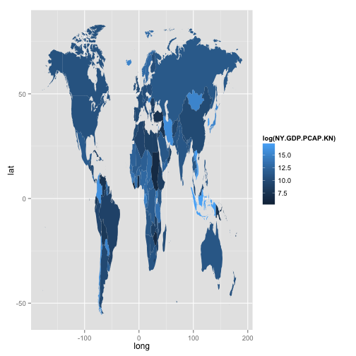
This is not perfect, but much better.
Question 2: install the package countrycode and use the countrycode function to add a region indicator to the dataset. Create a world map faceted by your region indicator.
This is easy to do once you know how the countrycode function works.
df.map.2$continent = countrycode(df.map.2$iso2c,
                                 origin = "iso2c", destination = "continent")
Filter the data to make a better plot
library("dplyr")
df.map.2 = df.map.2 %>%
  filter(!is.na(long)) %>%
  filter(!is.na(lat))
Remove outliers
df.map.2 = df.map.2 %>%
  group_by(continent) %>%
  filter(lat >= quantile(lat, probs = .02, names = FALSE)) %>%
  filter(lat < quantile(lat, probs = .98, names = FALSE)) %>%
  filter(long >= quantile(long, probs = .02, names = FALSE)) %>%
  filter(long < quantile(long, probs = .98, names = FALSE))
Generate plot
p = ggplot(df.map.2, aes(x = long, y = lat, group = group, fill = log(NY.GDP.PCAP.KN)))
p + geom_polygon() + facet_wrap(~ continent, scales = "free")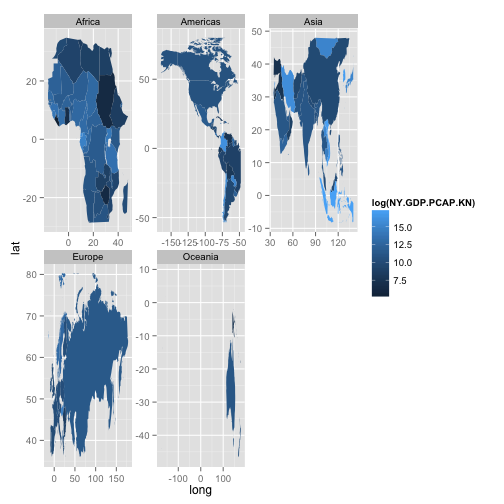
Exercise 2
Load data
library("mapDK")
df = mapDK::votes
Question 1: use the mapDK package to make a map of votes (in pct) for the Conservative Party (“detkonservativefolkeparti”) at the polling place level.
mapDK(values = "stemmer", id = "id",
  data = subset(votes, navn == "detkonservativefolkeparti"),
  detail = "polling", show_missing = FALSE,
  guide.label = "Stemmer \nKonservative (pct)")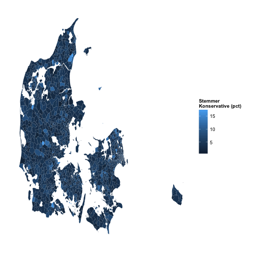
Question 2: read up on the documentation for the dplyr package to aggregate the data into votes (in pct) for the Conservatives at the municipal level. Plot the data using mapDK
Prepare the data
library("mapDK")
df.map = mapDK::polling
df.plot = left_join(df, df.map)

df.plot.agg = df.plot %>%
  filter(navn == "detkonservativefolkeparti") %>%
  group_by(KommuneNav) %>%
  summarise(votes = sum(stemmer)) %>%
  data.frame
Plot
mapDK(values = "votes", id = "KommuneNav",
  data = df.plot.agg,, show_missing = FALSE,
  guide.label = "Stemmer \nKonservative (pct)")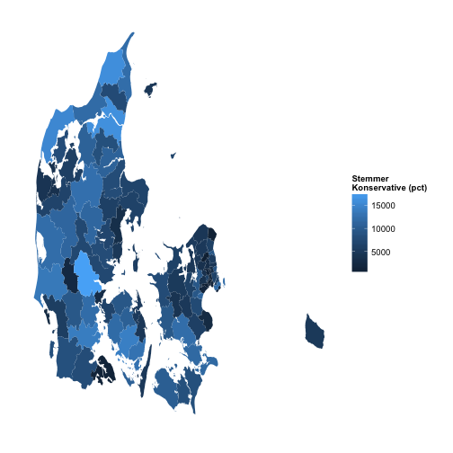
Question 3: Repeat question 2 but only for the municipalities “Aarhus” and “Koebenhavn”.
mapDK(values = "votes", id = "KommuneNav",
  data = df.plot.agg,, show_missing = FALSE,
  guide.label = "Stemmer \nKonservative (pct)",
  sub = c("aarhus", "koebenhavn"))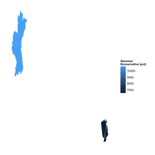
Exercise 3
Load data
library("readr")
df = read_csv("https://raw.githubusercontent.com/sebastianbarfort/sds/master/data/FV15_data.csv")
Question 1: Use the dplyr package to aggregate the number of likes by party and “storkreds”
df.agg = df %>%
  group_by(PARTI, STORKREDS) %>%
  summarise(
    likes = sum(likes)
  )
head(df.agg)
## Source: local data frame [6 x 3]
## Groups: PARTI [1]
##
## PARTI STORKREDS likes
## (chr) (chr) (int)
## 1 Alternativet Bornholms Storkreds 2728
## 2 Alternativet Fyns Storkreds 23526
## 3 Alternativet Københavns omegns Storkreds 22785
## 4 Alternativet Københavns Storkreds 334671
## 5 Alternativet Nordjyllands Storkreds 21321
## 6 Alternativet Nordsjællands Storkreds 14501Question 3: Use the dplyr package to sort the dataset according to the number of likes. Which candidate in the data is most popular? Create a dataset with only the most popular candidate by “storkreds”.
df.agg.2 = df %>%
  group_by(NAVN, STORKREDS) %>%
  summarise(
    mean.likes = mean(likes)
  ) %>%
  ungroup() %>%
  group_by(STORKREDS) %>%
  top_n(1)

head(df.agg.2, 10)
## Source: local data frame [10 x 3]
## Groups: STORKREDS [10]
##
## NAVN STORKREDS mean.likes
## (chr) (chr) (dbl)
## 1 Anders Samuelsen Nordsjællands Storkreds 58502.66667
## 2 Andreas Albertsen Vestjyllands storkreds 2663.16667
## 3 Annette Vilhelmsen Fyns storkreds 7146.16667
## 4 Birgitte Kjøller Pedersen Bornholm 168.00000
## 5 Bo Fink Nordjylland 59.08333
## 6 Dan Jørgensen Fyns Storkreds 55143.58333
## 7 Helle Thorning-Schmidt Københavns Storkreds 187281.08333
## 8 Holger K. Nielsen Københavns Omegn 6987.41667
## 9 Inger Støjberg Vestjyllands Storkreds 52199.83333
## 10 Jacob Mark Sjællands storkreds 5386.83333